
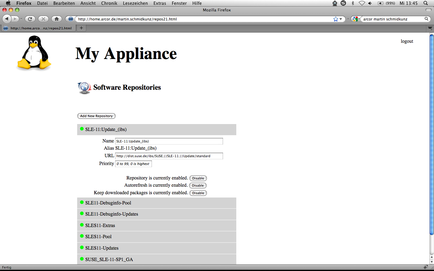
Hi! Please find an idea of repo module UI at: http://home.arcor.de/martin.schmidkunz/repos21.html The main differences to the current UI are: * compliance with basic concept of overviews as shown on gagarin.suse.de (OK, the edit string and delete functionality is missing, but I am sure you`ll figure it out :-)) * less information on screen * hints on priority * first implementation of enable/disable in YaST based on current survey results My usability questions are: * What do you think about the mock up? * What does "Keep downloaded packages" mean? * Does the target user group member know what the term "repository" is? I doubt that. * Does the target user group member know about "priorities"? Shouldn`t it be explained a little bit more? Tooltip? Looking forward to your comments! Cu, Martin ---------------------------------------------------------------- Martin Schmidkunz User Experience Specialist martin.schmidkunz@novell.com +49 (0) 911 740 53-346 ----------------------------------------------------------------- SUSE LINUX Products GmbH, GF: Markus Rex, HRB 16746 (AG Nürnberg) ----------------------------------------------------------------- Novell, Inc. Novell® Making IT Work As One™