
I am an Ubuntu user and have been for some 8 months (after I switched form openSUSE with KDE after many years [because of KDE if you are interested]).
Welcome. Hope you have fun here in openSUSE :)
Below I provide some pics of what my Ubuntu desktop looks like normally - *EXCEPT *that the top and bottom panels are *NOT* displayed as they are auto-hidden; the desktop therefore is "clean", with no icons or widgets or whatever of whatever description or manner or size. The screen shot of this is:
http://picpaste.com/ubuntu-a-UKX6vktc.jpg
At the top left you will see entries for Applications, Places, and System. I have opened each up and, in sequence, the screen shots for them are:
http://picpaste.com/ubuntu-apps-a-ryrYmU2V.jpg
It is the traditional GNOME main menu which can still be added via "Add to panel ". However,
The above is what an Ubuntu user basically sees when s/he installs Ubuntu. They also see same (or close enough) when they install MINTLinux which is based on Ubuntu.
Compare this to what oS Gnome now has.
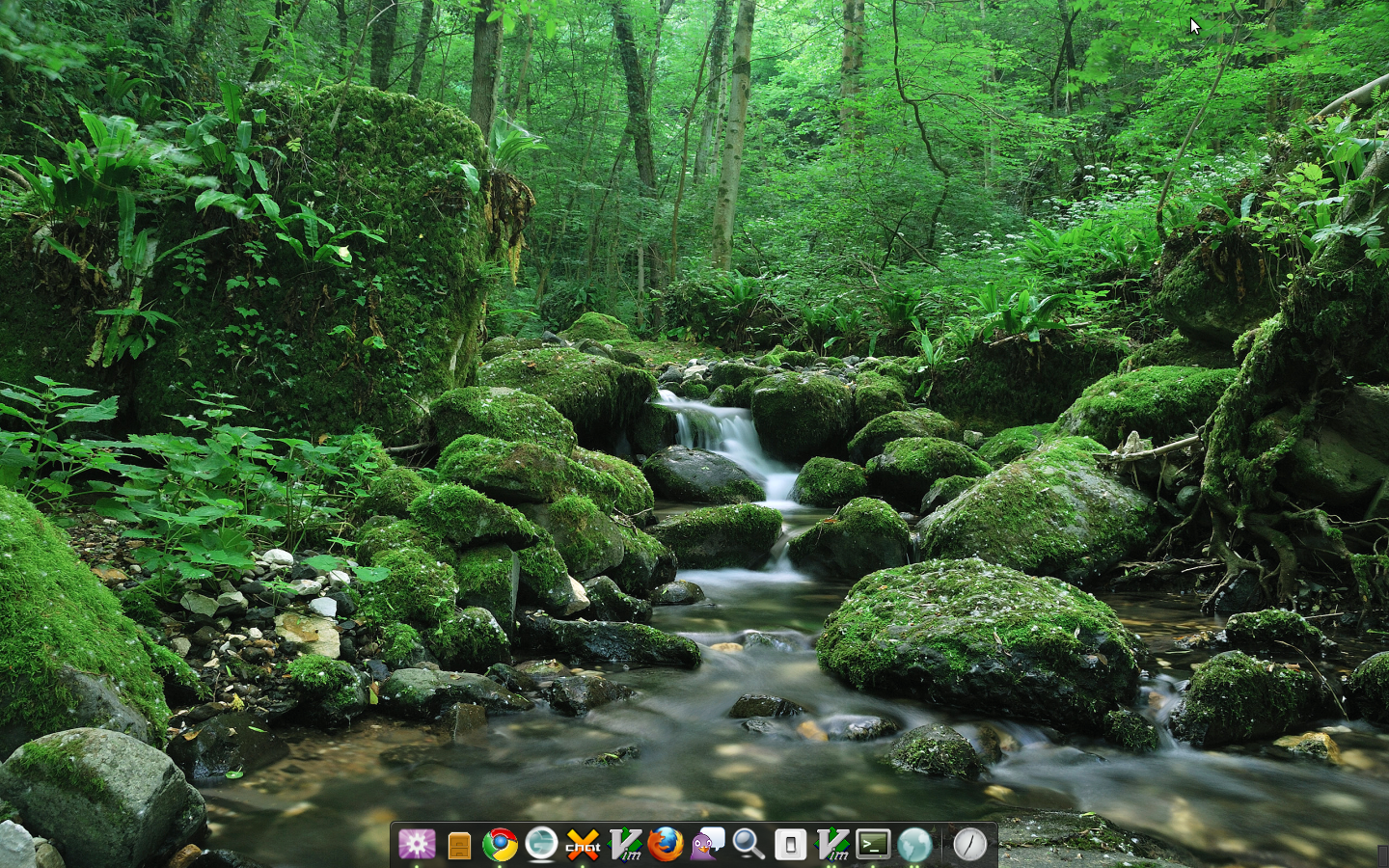
I disagree that it is more intuitive than the "Computer " menu. Our customized Computer menu is much more suited for most home users imho. Most of the times, people want to use 4 to 5 applications only. Like, Browser, Music player, Office software, etc. So, I believe our current Computer menu is good. It's probably a matter of taste difference as well. FWIW, I don't use any panels or menus at all, I hide my panel and move it to the bottom right corner. I use gnome-do with the docky option and get wallpapers from webilder. It is the most beautiful desktop as per my taste. (attached image) I agree that there are a few areas where we could be more aesthetic, like the notification areas, the window title bars etc. Please convey your ideas for improvement to badshah400 in #opensuse-gnome so that he could add these to the list of pet-peeves which we want to fix. Thanks for your feedback. Sankar http://psankar.blogspot.com